![]()
I made this list based on my experiences with icon themes, some of them have already been laid out in some Terminal Root Channel videos, but others have been combed and tested to be part of here.
Installation is standard on any Linux, ie just download the package, extract and move to the icon directory in your user’s root folder: ~/.icons/, if there is no such directory, create: mkdir ~/.icons . Whether to enable will depend on each Interface/Desktop Environment and window managers.
Let’s get to know these 8 best!
01. Deepin
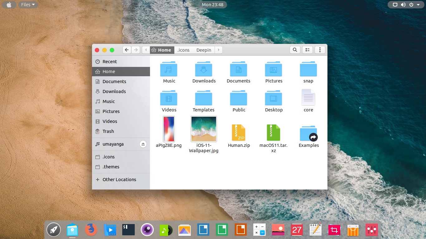
Deepin I think was one of the icon themes that I used most to date, does not harm the view and even customizes some directories facilitating the quick view. It has an app icon theme that recognizes most and doesn’t distort which doesn’t make it hard to identify. Worth trying:
To install unzip after download and move to the icon directory, to work, just activate in the configuration menu of your desktop.
tar zxvf Deepin.tar.gz
mv Deepin/ ~/.icons/
02. Breeze
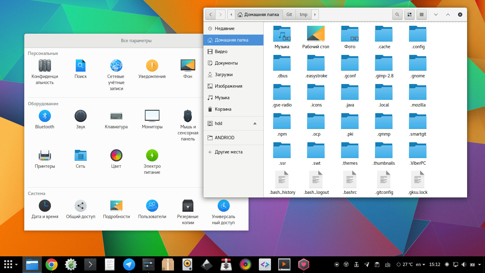
I am currently using this icon theme, I like the minimalist icons that are displayed in the file manager window, as well as the close button that has the “air” highlighted, it has a clean and exciting look. It is also worth trying:
To install unzip after download and move to the icon directory, to work, just activate in the configuration menu of your desktop.
tar zxvf Breeze.tar.gz
mv Breeze/ ~/.icons/
03. Vibrancy
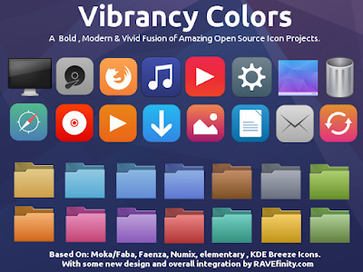
Vibrancy is actually a collection of icons, where only the colors change. It has 71 different color style, I particularly like Purple Dark style more, but it goes for taste. We already showed him here in the FreeBSD series. Worth trying:
The installation is a bit different in that it has subdirectory themes, so either move all icons, or choose to move by color. Unzip after download and move all icon directories to work, just activate in your desktop setup menu.
tar zxvf Vibrancy.tar.gz
mv Vibrancy/* ~/.icons/
04. Papirus
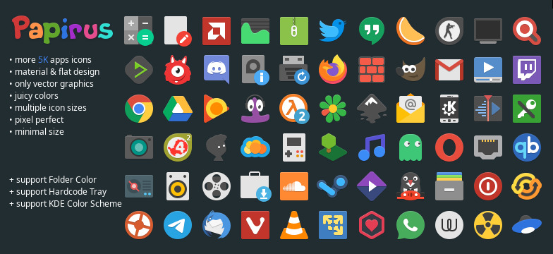
Papirus is very similar to Deepin Icons, the only thing that changes is the style of the folders, it has a light blue, but more toned, and darker edges with a more peculiar design, is a good alternative too:
To install unzip after download and move to the icon directory, to work, just activate in the configuration menu of your desktop.
tar zxvf Papirus.tar.gz
mv Papirus/ ~/.icons/
05. Luv
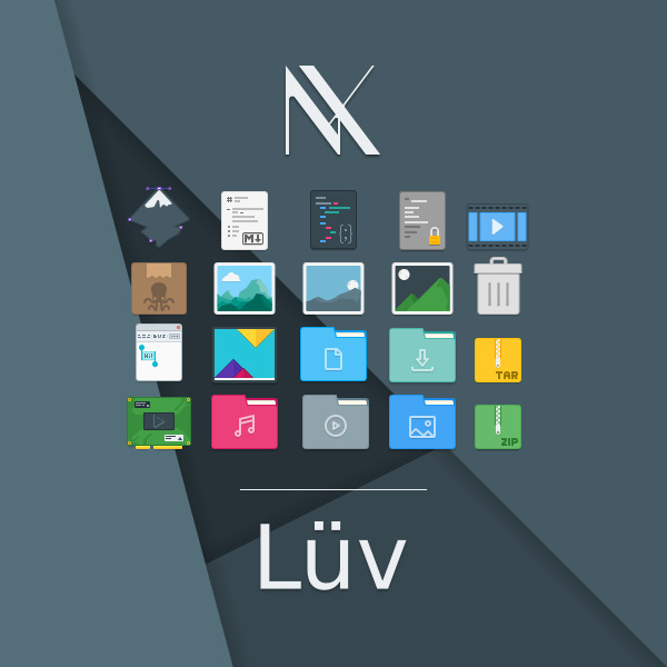
Luv, let’s say, is the most original on this list, it’s the new version of the famous Numix, it gives it a more “office” feel, and I found it really cool, every now and then I turn it on to differentiate a little bit, ie worth having in your icon directory along with others.
To install unzip after download and move to the icon directory, to work, just activate in the configuration menu of your desktop.
tar zxvf Luv.tar.gz
mv Luv/ ~/.icons/
06. Numix Circle
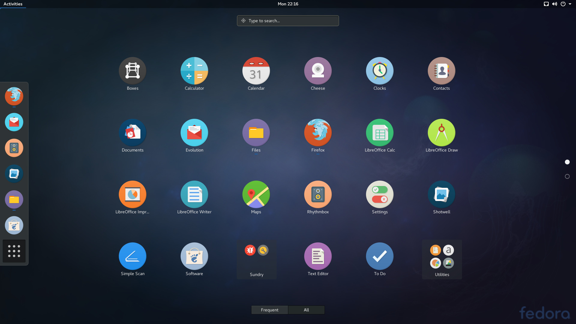
This one is from the same Luv family (let’s say it’s a Luv in the form of circles), but it has some things of its own. I have never used it, but I have noticed that it is quite successful among Linusers.
To install unzip after download and move to the icon directory, to work, just activate in the configuration menu of your desktop.
tar zxvf NumixCircle.tar.gz
mv NumixCircle/ ~/.icons/
07. Mojave
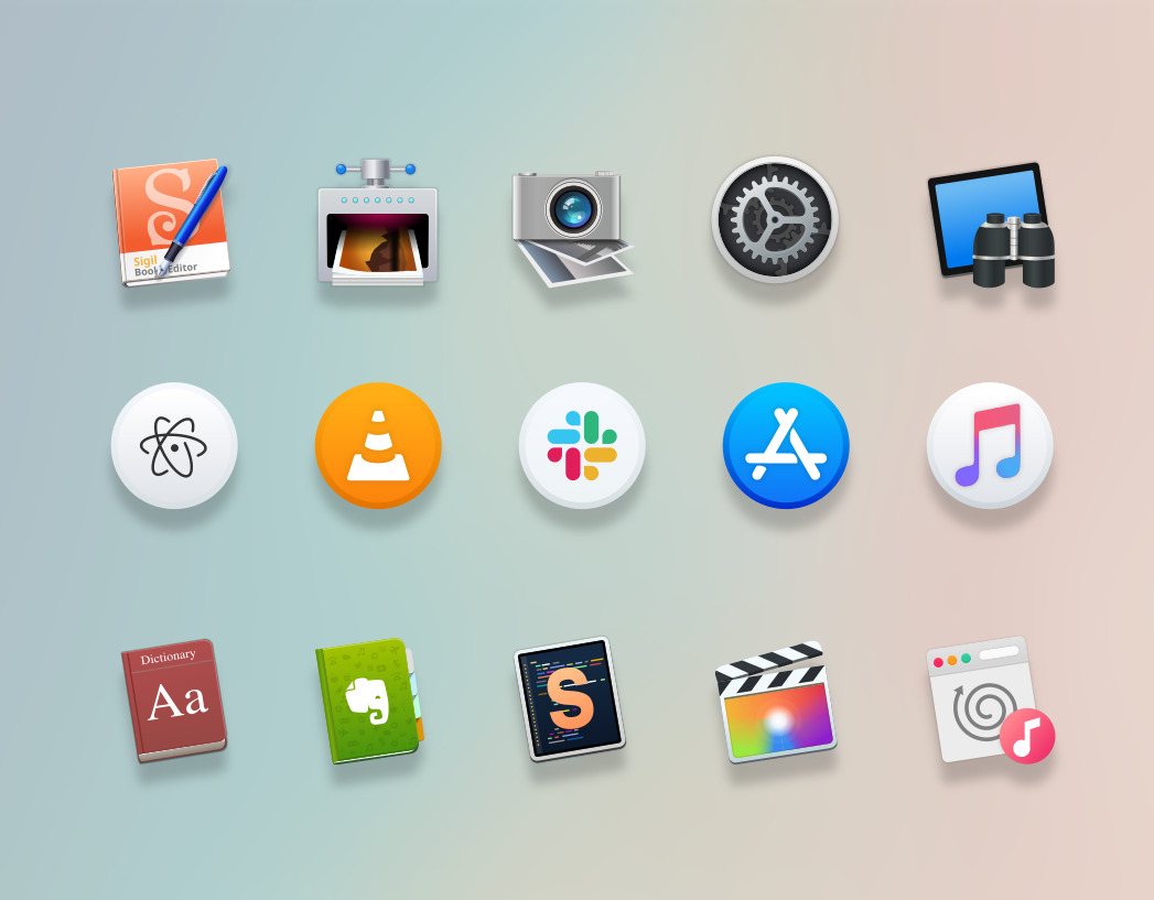
The name says it all! It is based on the macOS icons. For those who like a more elaborate design theme, this is a good order.
To install unzip after download and move to the icon directory, to work, just activate in the configuration menu of your desktop.
tar zxvf Mojave.tar.gz
mv Mojave/ ~/.icons/
08. Cupertino
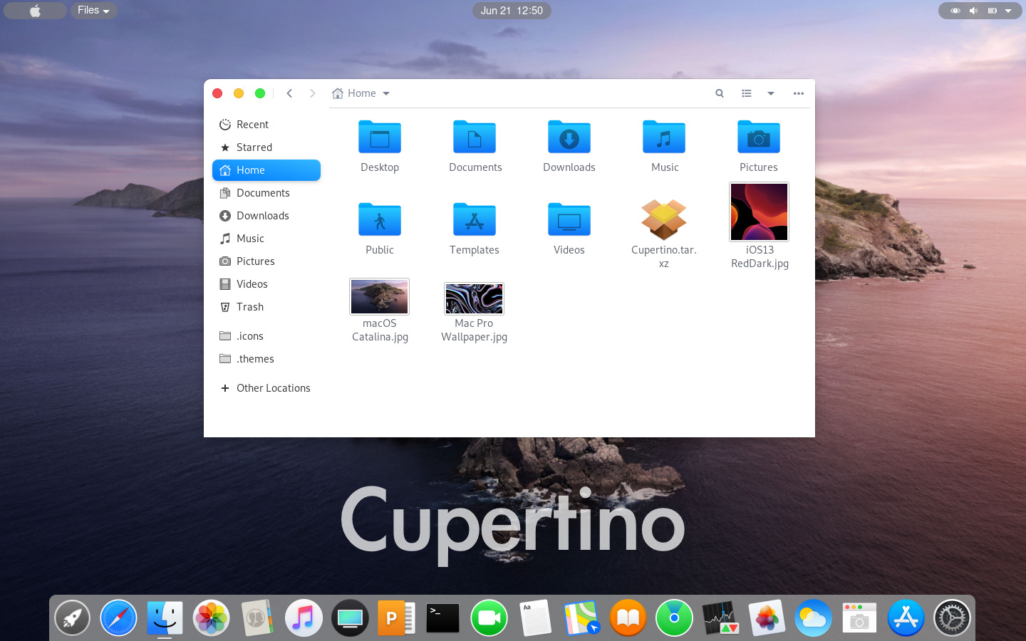
And finally, the Cupertino, he is very similar to Mojave, but has some modified tones. I put in this list precisely for the same reason as the previous one, the number of people who like it is large, and of course, I found it very cool too.
To install unzip after download and move to the icon directory. To work simply activate in the configuration menu of your desktop.
tar zxvf Cupertino.tar.gz
mv Cupertino/ ~/.icons/
Thanks!

